Thursday, 31 July 2014

Favourite Finds

I think you're going to love my most recent "favourite finds"... These Thomo & Coach Timber Boxes are super cool. The boxes are hand crafted and designed by Melbourne based company, Thomo & Coach - Anoushka Thompson and Steve Gourlay - and custom painted by Sydney graffiti artist, Roach.


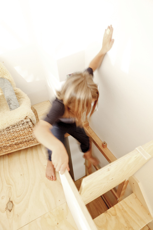
Lea Korzeczek and Matthias Hiller are the founders and creative directors of Danish company STUDIO OINK. One of their specialities is creating customised interior design concepts, and their 'marvelous all-in-one bunk bed' is pretty spectacular. A bunk bed, playground, dressing room and storage space, it features two secret staircases and a lockable trapdoor. The built-in wardrobe is accessible both ways and there is even a pull-out guest bed for sleepovers. Wouldn't this be every kids' dream?! Not to mention an excellent use of space.


Last but not least, have you been to visit my GREAT.LY boutique yet? It's filled with products that I've hand picked from the amazing GREAT.LY makers. I will be regularly adding new pieces, so make sure you keep stopping by. Some of my latest additions...


Bonjour artwork by Xavier&Me

Kite rug by Xavier&Me

Composition 5 Print by Jaime Derringer

Wednesday, 30 July 2014

The Beach House | Homepolish

Since I first discovered Homepolish, I've been a fan (my first post), and love checking up on their projects for a healthy dose of inspiration. Homepolish works with talented young designers, their aim is to make interior design accessible to everyone.


I was super envious of this gorgeous beach house project - firstly, I love the pared back sophistication and breathtaking location; but also because the homeowner, John, briefed Orlando, the designer and Homepolish's LA Creative Director, handed over his keys and flew back to his house in San Francisco. Orlando was left with a beautiful empty shell in which to create a relaxing retreat for John and his friends. This would be a dream job for me!


Orlando has done a brilliant job designing the layout, sourcing all the furniture, delivery and installation. Colour has been used sparingly and reflects the seaside surroundings. The furniture all has gorgeous clean lines to add to the sense of calm, and the materials used are simply stunning - marble, brass, concrete, and those amazing golden jute rugs.


You know how much I love tiny nooks, and this little work space may be my favourite - so simple, so stunning.


The bedroom boasts the same simple elegance. Such a gorgeous space, if I was John, the hardest part would be packing up and leaving each time. Isn't it fabulous?! To see and read more about this project, pop over here.


Tuesday, 29 July 2014

Birds of a Feather | Claire Rosen

With my great love of pattern & colour, wallpaper, and birds, you can imagine my delight when I came across these incredibly gorgeous photos by Claire Rosen. The series is called "Birds of a Feather". Each live bird is photographed in front of a backdrop of complementary vintage wallpaper.


I am so impressed with Claire's photography. You can imagine how difficult it would be to capture the birds in a still photo, and she's matched them so beautifully with their wallpaper. I would love one hanging on my wall, but which would I choose? Which is your favourite? Be sure to go and see the complete series here.

Monday, 28 July 2014

Creating an Entrance

I've said it a lot, I know, but I feel very strongly about how important a good entranceway in a home is. It creates your first impression and it welcomes you into the house. Dael & I are working with a client whose first point of entry is through a set of French doors straight into the living room. I know there are a lot of homes that don't have a foyer or entry hall, but that doesn't mean you can't still create an illusion of an entranceway.

There are two ways to do this... create a physical barrier, or a visual one. You can use furniture pieces to create a physical barrier. A sofa can be positioned so that it's back creates a walkway, or mini hallway. You could also use a large (securely fastened) bookshelf or cabinet.


1 | 2 | 3


A visual barrier is created by giving you something to instantly focus on as you enter the house. A console or hall table gives you a place to pause as you enter, also a place to pop your keys or the mail.


1


A mirror or piece of art above the table helps to anchor the setting, and a rug or runner is perfect for leading you into the room.


1 | 2


A long stool works well too - it provides a place to put your shoes on as you're heading out, or pop your bag down when coming in. Again, the art helps define the space and the rug welcomes and leads you in.


1 | 2


This little round table (below) is placed just inside the doors, working in the same way as the console tables and stools. The cowhide rug is the anchor this time, stopping the table from floating aimlessly in the space.


1


The room our clients first walk into is large and open plan, so we will be using quite a long credenza. Plenty of drawers will provide storage for mail and bits and pieces they want to hide away. On top we'll be able to create a lovely welcoming vignette, and hang a favourite piece of art behind.


1


Does your front door lead straight into a room rather than a hall? If so, what are your tricks?

Friday, 25 July 2014

Introducing shoptrawl

I've got a brilliant new website to introduce you to... shoptrawl is a one-stop online shopping destination for Australian and New Zealand furniture, homeware and fashion design. All your favourite designers and stores in one place for your ease and convenience.


The website evolved when co-founders, Victoria Hamilton (Melbourne-based), Sally Langford (Sydney-based), and Anna Agnola (Brisbane-based) became frustrated at having to bookmark so many of their favourite sites. The idea evolved when they realised there wasn't a single online resource where you could simultaneously see, save, and share all the products you loved from your favourite shops and designers.


You start by creating a FREE 'my shoptrawl' account. By clicking on the heart shape in the product information it saves that product to your wishlist. You can click on the star to save a store or designer to your 'favourites', allowing you to easily search for products from your favourite places. You can share your finds with friends, either individual products or email your entire wishlist - perfect for sending the hubby before your birthday, or maybe even as your wedding register.


When the team at shoptrawl invited me to do a Guest Edit, I jumped at the chance. I love the concept, and they have an excellent selection of products and designers, like Bonnie and Neil, Homebase Collection, Jane DentonRachel Castle, Sass & Bide, and many more. I have chosen my top 12 products and saved them to my wishlist. It was really hard to stop at 12, I could easily have tripled that! Check out my picks here.


shoptrawl doesn't stock, sell or ship any of the products. When you're ready to purchase you are re-directed to the website of the original store or designer. I highly recommend you head over to shoptrawl right now, sign up and start shopping. I know you're going to love this site - you can thank me later ;)

Thursday, 24 July 2014

Neutral Sofa

If there's one piece of furniture that I recommend you invest in, and don't scrimp on, it's your sofa. Other than your bed, it really is the furniture piece you're likely to use the most, and it needs to be quality and comfortable as well as looking good.


You can't go wrong with a great neutral sofa. If you're brave try white (many now come with removable slip covers for washing), otherwise a light grey or oatmeal colour. Don't get me wrong, I love a coloured sofa, but by choosing a neutral colour it's really easy to change the look and feel of your living room. Add a throw, swap your cushions, a new side table and a piece of art, and you've reinvented your space while retaining your fabulous sofa.


1 | 2 | 3 | 4 | 5 | 6

Wednesday, 23 July 2014

Duck Egg Blue | Three Ways

I usually favour strong, vibrant colours, but one of my all-time favourite colours is duck egg blue. Soft and pretty, it's fresh when teamed with white, looks gorgeous with warm wood tones and pinks, and holds it own when paired with bold black.


1 | 2 | 3

Blogging tips