It's the start of another awesome week, and for all you clever crafty types itching for another project, I've got a few fabulous ideas...
I love these house numbers nestled into a bed of grass and contained in a smart box frame. It's creator, Laura Gummerman from 'A Beautiful Mess' blog, gives you step by step instructions on how to make your own.
Check your local hardware store for fake grass, but I also found this aqua grass mat (below), usually used in fishponds, which is long and lush looking.
My daughter's tiny, wardrobe-less bedroom means that I'm always impressed by hanging storage solutions. This DIY Copper Clothing Rack is right on trend, and really beautiful.
Created from copper piping (again, check your local hardware store), Madelynn Furlong of 'Wide Eyed Legless' photographed her project step by step to feature over on the 'SF Girl by Bay' blog. It's such a great use of space in a small room, so I'm definitely going to try making this for Jessie's room.
Over the weekend I filled a bag with clothes I don't wear much anymore. It's always a good feeling to clear and un-clutter your home, and I'll drop my bag down to the Salvation Army. But if you're doing the same thing, consider holding onto one of your old t-shirts and turning it into this adorable little teddy bear by Evie Barrow.
So many clever ideas! I hope you're inspired to get creating yourself now.

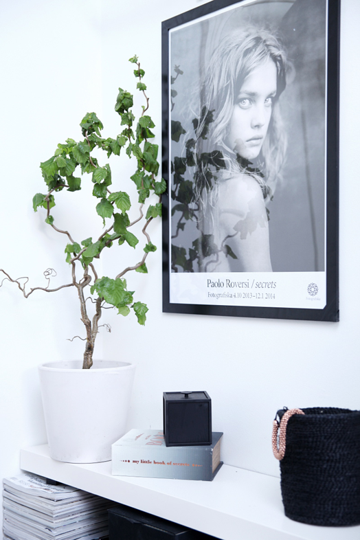
In my home I am often moving things around, creating new vignettes, changing it up. Last week my black and white rug was in the kitchen, now it's at the foot of my bed. Bowls, plants, vases, decorations, cushions - they're always circulating. A change is as good as a holiday, it keeps things fresh and exciting.
Norwegian blogger, Henrietta Kalbekken, takes it to a whole new level. She is so clever and creative, regularly posting photos of her beautiful, and ever-changing home on her blog, designlykke. Below you'll see six different interpretations of her living room (starting with the most recent), all from this year. She changes the wall colour, the artwork, rugs and decor, and along the way she got a new sofa.
I'm not suggesting you buy lots of new furniture pieces and paint your walls every few months (unless you want to), but try circulating existing pieces around. Have a play and see what works and what doesn't, you can always change it back. I'll leave you with some more inspirational photos from Henrietta's home. You may notice artwork and rugs moving around in these rooms too.
I've just found some time to sit down and read the latest issue of Rue Magazine. Two of the feature homes struck a chord with me, although they're both very different to each other.
The first belongs to New York illustrator and style expert, Dallas Shaw. An older house, Dallas has retained the charm and details while adding her bold, punchy style to each room.
The second, amazingly, is a rented apartment, also in New York. The occupant, a young corporate attorney, hired the services of Common Bond Design to help him turn his bachelor pad into a refuge from work, and a place to entertain friends. They did a brilliant job with a low-cost overhaul, investing in pieces that could be taken with him to his next home.
The only addition that will remain is the fresh paint on the walls, which was absolutely necessary. A clean coat of fresh white was used throughout, but in the bedroom a bold statement was achieved with a gorgeous blue stripe the same height as the headboard.
When extra storage was needed in the bedroom, the designers custom painted a credenza the same colour as the wall. I love the way the framed print hangs slightly over the blue, linking the two halves.
There is plenty more goodness to be found in the latest Rue Magazine, so find some time to check it all out for yourself.
This incredible apartment by Russian architecture firm INT2 is so cleverly thought out, everything flows, and there is a beautiful sense of cohesiveness.
A three sided built-in bookshelf provides a wall divider between the entrance and home office (you can see more of this further on in this tour).
When the TV is not turned on, the wallpaper behind becomes the feature. This leads your eye down to the rug, which also acts as an anchor for the living area in the large open space.
It's a toss up whether my favourite space is the kitchen or dining area. Even though they're both part of the large open plan, they have clever features which help to define their zone.
The kitchen has a striking batten ceiling to claim it's space. The dark wood on the front of the island bench is a gorgeous contrast to the stark white, and marks the end of the kitchen.
The dining room, with it's raised floor and lowered ceiling, is like a room within a room - a room with no walls - I love it!
Each space has very different, but equally stunning lighting. The light wood on the back of the island bench adds a link to the dining room.
A small alcove between the dining area and home office is the perfect spot for the piano. The grey wall is what defines this space, and this continues along one wall of the office beyond.
I love the half blue wall in the bedroom. It's a beautiful backdrop to the simple white bedding, and the mirror is a genius way of linking the two.
The wall behind the TV in the bedroom is reminiscent of the kitchen ceiling, and (like the wallpaper panel behind the TV in the living area) it takes some of the emphasis away from the TV. TVs are often a necessary part of a home, but I love seeing clever ways of making them not the main focus of a room.
More beautiful batten ceilings in the bathroom, and the tiles remind you of the wallpaper and rugs in the main living areas - there's that cohesiveness!
Everything has been thought of in this apartment - even the wardrobe and laundry are beautiful in the same simple, clean-lined style. If you look carefully you'll notice the mirror at the end of the wardrobe reflects the perfectly placed chair in the entrance (first pic). I've got lots of inspiration from this apartment, I hope you have to.
In my post yesterday on Fenton & Fenton, I featured some photographs taken by Armelle Habib. I popped over to Armelle's website to see more of her work and was blown away. She works as a lifestyle and interiors photographer for some of the leading Australian and international publications, as well as lots of other fab, well known clients. I was going to select some of my favourite photos of Armelle's, but after seeing the beautiful home of Simone Haag, I knew I had to share it with you.
Simone works as a hunter gatherer/stylist/communications manager for interior design studio Hecker Guthrie, and is also a monthly contributor to The Design Files. Her talent is obvious in the home she shares with her husband, Rhys, and their Irish wolfhound, Tank.
Simone has chosen to decorate her home in my favourite quiet colour palette, which consists of lots of white, wood, and shades of blue. I love how the large freestanding oven has it's own recessed nook. And, of course, the beautiful Armadillo Marigold rug.
Such a beautiful home, don't you think?! Pure class! And amazing photography.